Table of Contents
This article contains affiliate links for which I may receive a small commission, at no additional cost to you, should you decide to make a purchase by using them. Learn More
Most people admire the beauty that they see. They define it through their own perception. As the saying goes, “beauty is in the eye of the beholder.” On the other hand, there is another definition of beauty, which is aesthetically pleasing.
Aesthetically pleasing represents something that is beautiful and appealing to the senses and obtains the basic design principles. These include proportion, balance, emphasis, contrast, unity, variety, pattern, and rhythm.
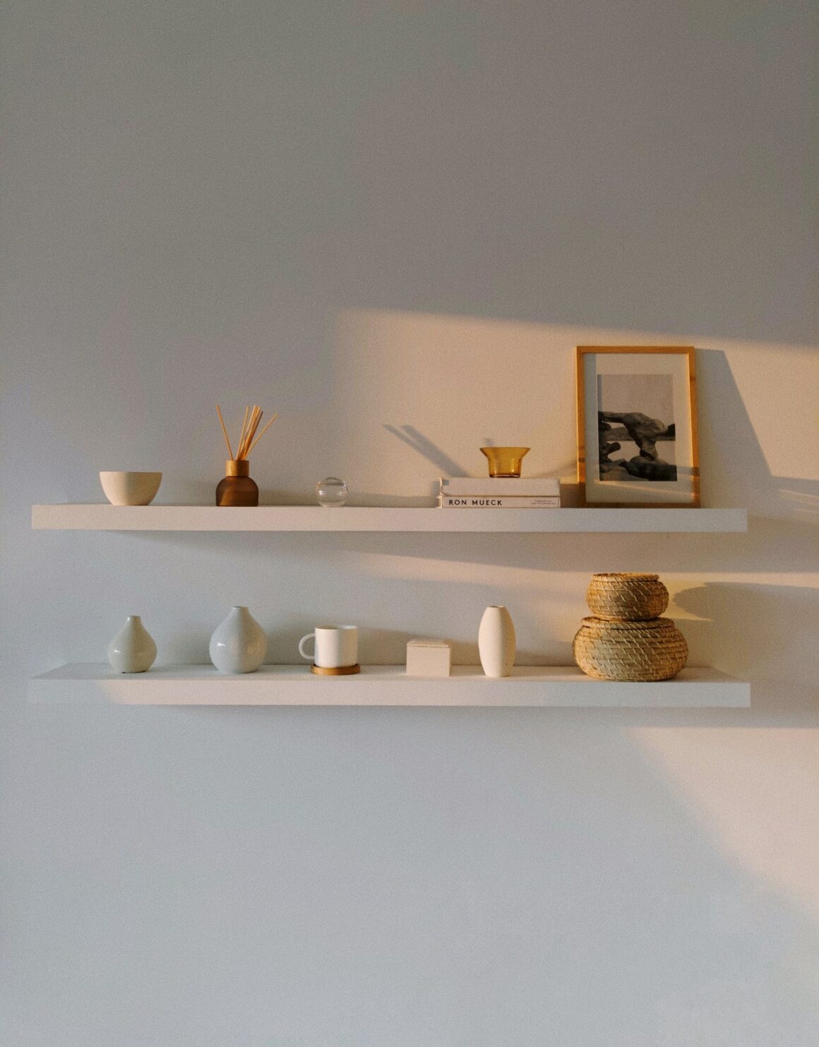
What makes something aesthetically pleasing? Here are some insights about this kind of impression, the process, and where it is usually applied.
What does aesthetically pleasing mean?
Take a walk on the bayside and wait for the sunset. Climb a mountain at dawn and see how the sun rises on the mountaintop. Look at the face of a baby and gaze at how he smiles. Visit a home with an uncluttered and clean space with blended colors. What do they have in common? They are all aesthetically pleasing.
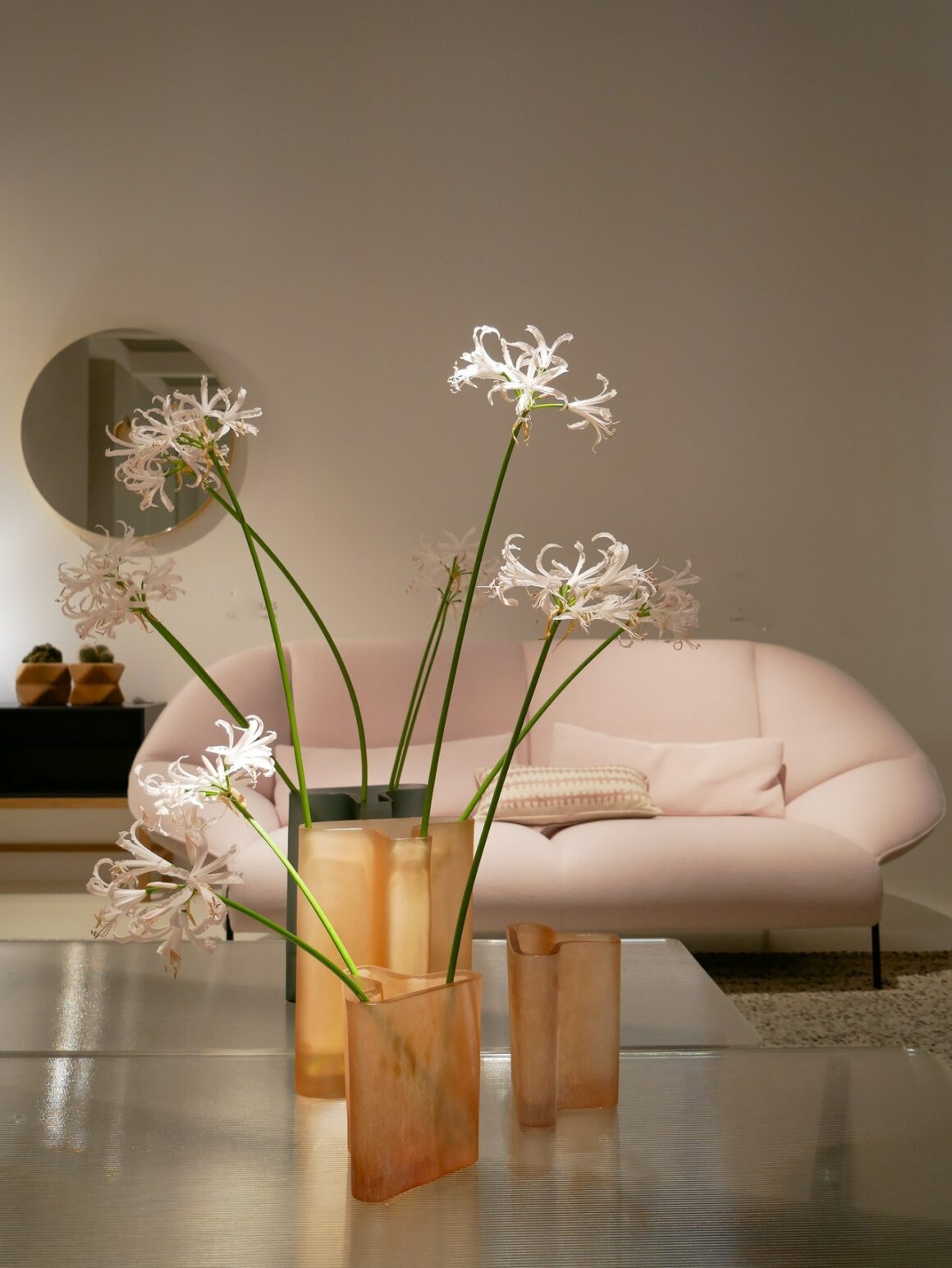
Aesthetically is all about appearance. And pleasing aesthetics is a thing that appeals to the senses or has a delightful sensory effect. It is something attractive to you.
The first impression when you see something beautiful, balanced, and in proportion is it is aesthetically pleasing. The difference between beautiful and aesthetically pleasing is that the latter is attained’s overall appearance and cohesiveness.
It is like a 4D experience and does not only use sight as you view something beautiful.
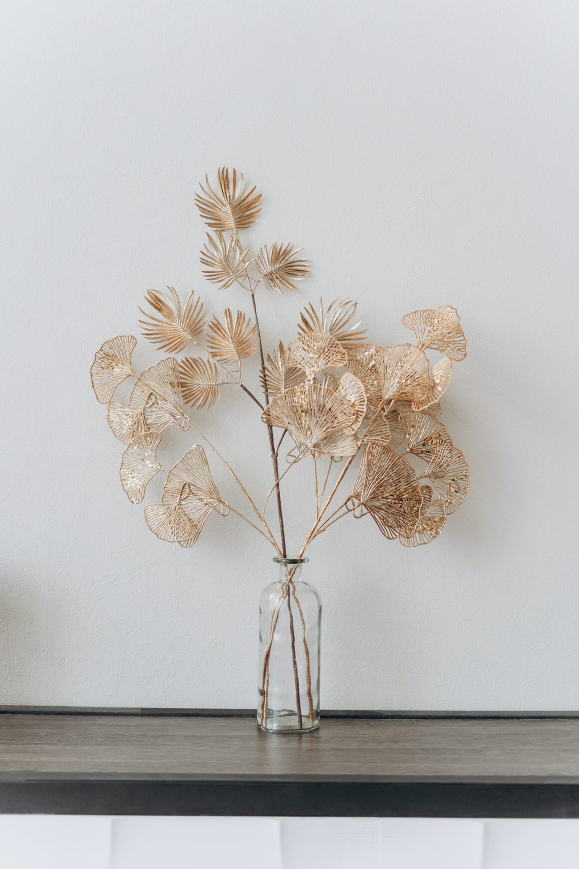
Aesthetically pleasing is derived from the word aesthetics, which refers to an object’s artful and creative appearance. Also, it means something pleasant and affirmative.
What is aesthetically pleasing in interior design?
Interior design is the art and science of improving the interior of the house or building to attain a healthier and more aesthetically pleasing environment for the owners. One of the designer’s goals is to make the space aesthetically pleasing.
In design, to have an aesthetically pleasing room, you must apply the basic principles of design. These principles include contrast, balance, emphasis, proportion, hierarchy, repetition, rhythm, pattern, white space, empty space, variety, and unity.
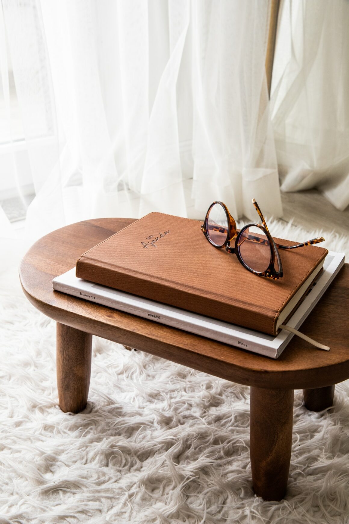
Other principles of design include color, alignment, shape, and form. Every element and accessory is designed and unified to create an aesthetically pleasing area.
“We design functional and aesthetically pleasing spaces with furnishings, lightings, flooring, windows, paint, and accessories.”
Carla Rausch Designs claimed,
For designers, aesthetically pleasing is also defined as the “golden ratio,” the main principle of beauty. The golden ratio is also known as the Divine Proportion, Golden Mean, the Greek Letter Phi, or the Golden Section.
What is the “Golden Ratio?”
The Golden Ratio is approximately equal to 1.618 and originally derived from the Fibonacci sequence. In math, the Golden Mean is the division of a line into two parts. The longer part (a) is divided by the smaller part (b) and then is equivalent to the sum of the longer part and the smaller part divided by, the longer part, which is equivalent to 1.618 or a 40/60 formula.

This formula is applied when you create layouts and room areas, choose colors, and produce forms and shapes.
In interior design, the golden ratio is a good instrument to create proportion, cohesive and comforting areas in your home, according to Martin Waller, founder of the global design company Andrew Martin.
“Some call it the 60/30/10 rule, which is based on the ratio, making it much easier to apply practically as you consider each element of your room using this ratio, from the scale of your furniture and structure details, right down to the color scheme and textural components.”
Martin Waller,
He also described the golden ratio as the theory of the thirds and can even exist in nature. Hence, you can use this formula in choosing accessories inside your room.

Examples include the unfurling of rose petals or the fenestration on monstera leaf, beautiful mason jars or classic jars, and natural wood home decors.
How to achieve an aesthetically pleasing space?
Aesthetically pleasing has this Wow factor when you have your first glance at it or as you enter the space. This is because everything is unified and blended into one that looks harmonious and proportioned, which is the main key to making a space aesthetically pleasing.

Also, an aesthetically pleasing space must attain the principle of design called balance. A balanced room must be proportioned in colors, patterns, and furniture.
You must create a feeling of balance in how these elements are laid out in space. You may use the golden ratio to create balanced schemes and achieve an aesthetically pleasing room.
Here’s how to create balanced schemes using the golden ratio:
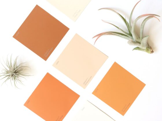
Color Schemes
“Color is a great way to get started with this theory.
Choose your three tones and split them into these ratios, 60% of your space should be one color, perhaps through the paint on your walls and larger pieces of furniture.
Choose another shade to be your 30% color and apply it through textiles such as curtains and rugs”
Martin Waller,
To break this down, you must have 60% dominant color, 30% secondary color, and 10% tertiary color.

Patterns
In decorating a room, usually, there are patterns you want to layout. These include wallpaper, sofa cushions, floor finish, carpet or rug, and accent walls. The golden ratio may be applied to create a balance in your pattern.
The principle is just the same. The main pattern that you want must cover at least 60% of the surfaces, and 40% of the surfaces are covered by your second choice of pattern.
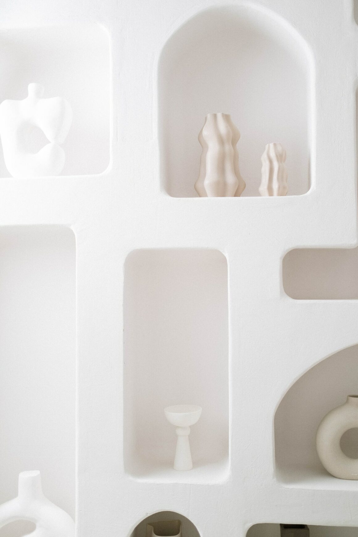
You may also break this down as 60% as your main pattern, 30% secondary pattern, and 10% or two sets of 5% of different patterns.
Also, it is important to know how you combine the patterns in a room, considering their colors too.
Furniture
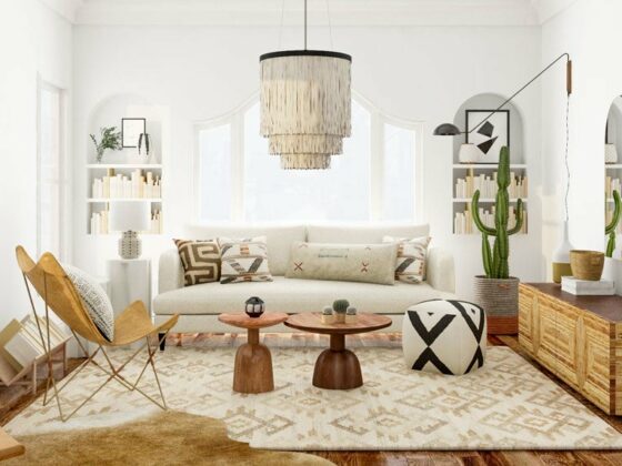
Furniture must be in proportion or balance in the space or room. If the area is small, you must have small to medium furniture. The same with a large area, furniture must fit well in the space, not too small or big for the area.
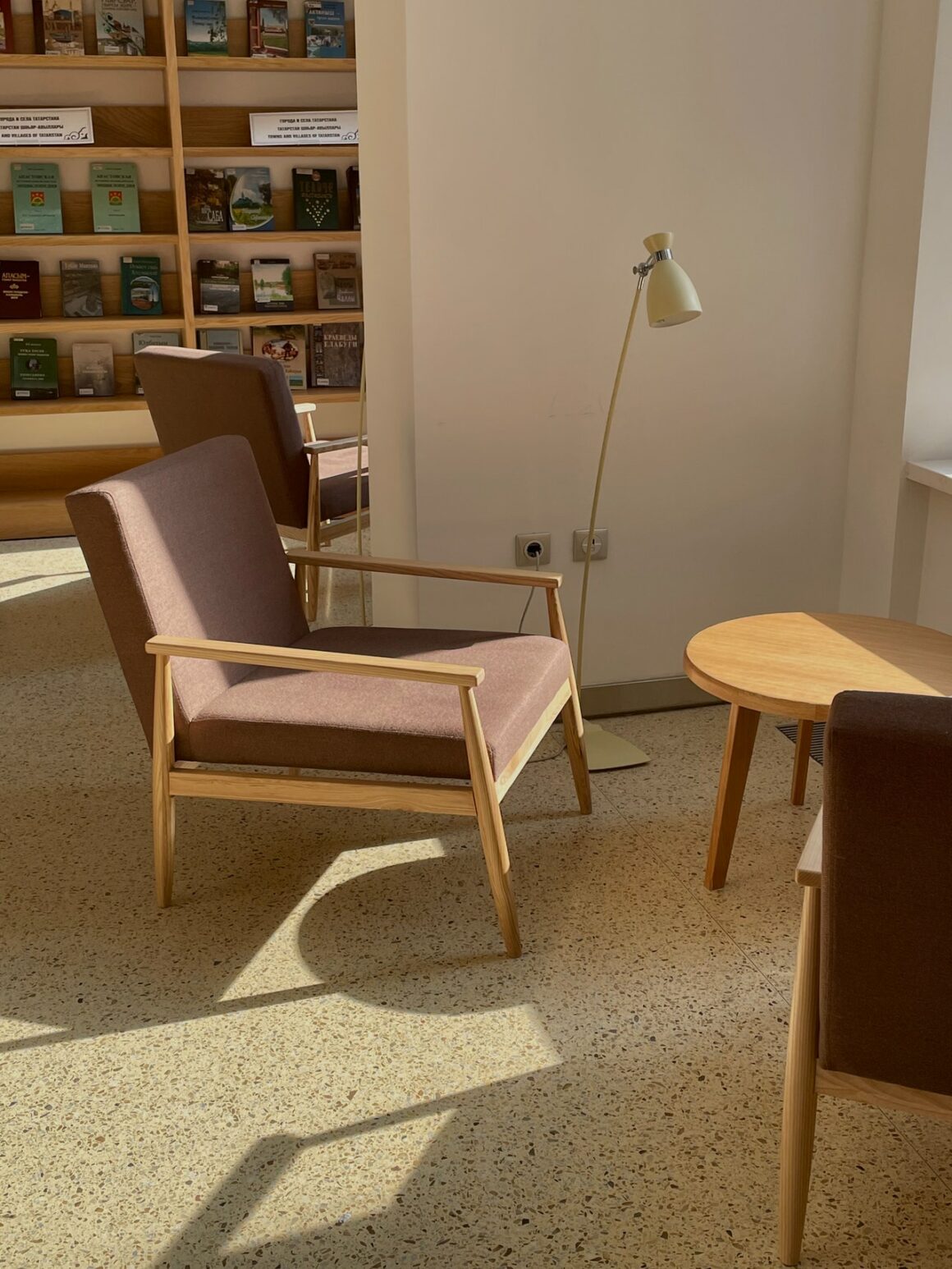
Also, apply the 60/40 formula. In a seating area or in the living room, the sofas must take up around 60% of the area, and the small coffee table is about 40% of the space.
Balanced Room Layout
Measure the floor area and use the 60/40 formula. The furniture must fill 60% of the space and 40% clear from furnishings.
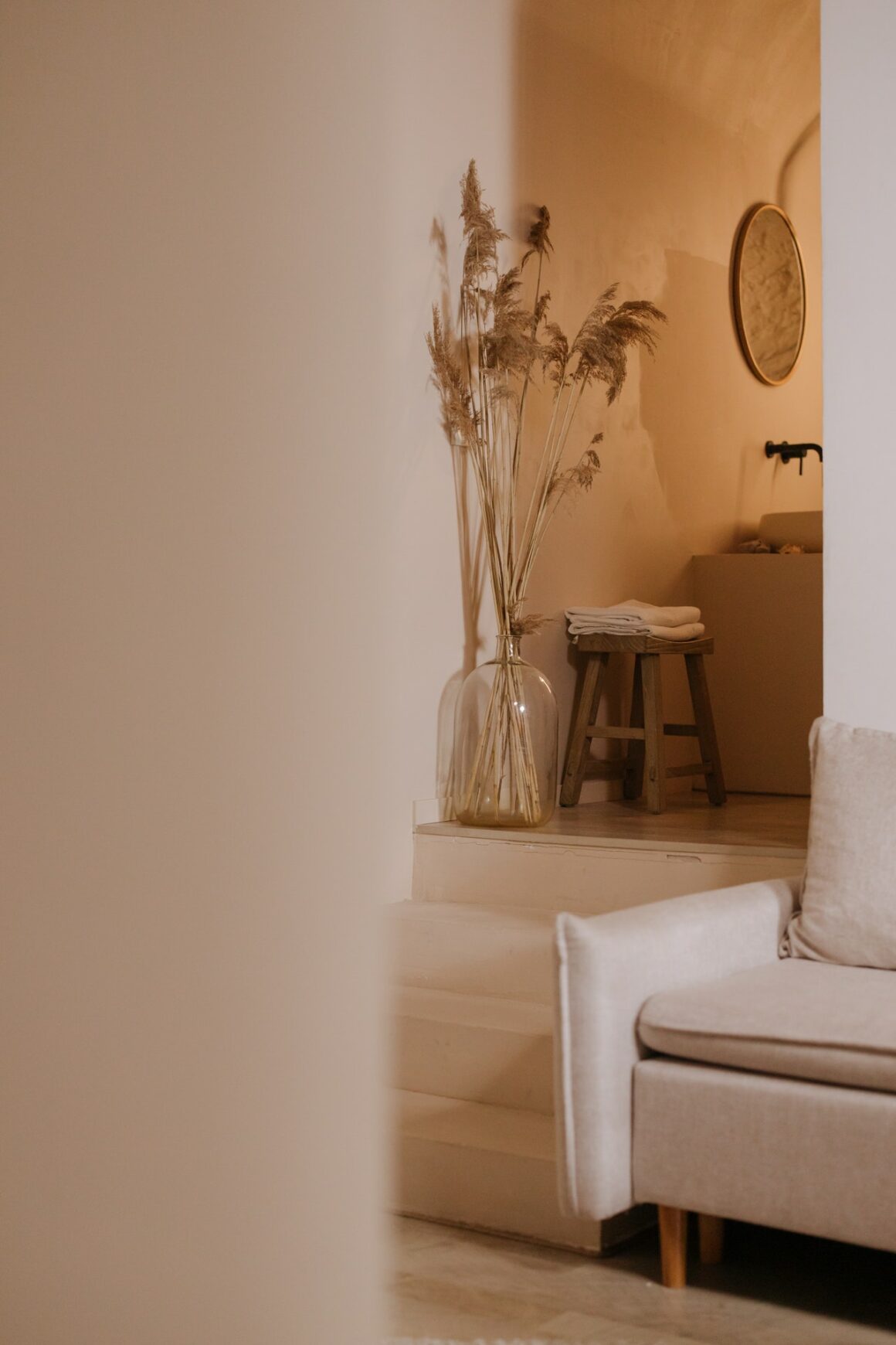
More than or less than the required percentage can make the area over-furnished or minimal, resulting in an unfriendly atmosphere.
Accessories
One example of this is the coffee table. You must not put many things on top of the coffee table.
Accessories may take up less than 40% of the coffee table. This can make your living area balanced and neat.
Likewise, you must have 60% books and 40% for other items such as your favorite accessories on your bookshelf.
In Conclusion
Aesthetically pleasing creates a lasting first impression. It matters and is significant to have a sound and friendly living space.
It is easy to achieve. Simply consider the basic principles of design, especially balance. And apply the golden ratio formula. It will indeed bring success to your design and create a harmonious space that is pleasant to your senses.

